Professionals at work
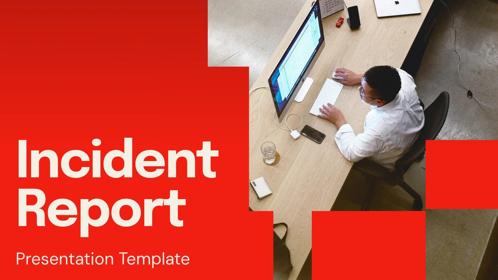
We document professionals’ moments of flow at home, the office, and everywhere else they work. Shown in clear, crisp light, they are active, mid-task, and rarely posed.
We aim to inspire professionals to make the best presentations of their careers. They should feel a sense of potential, ease, and activation when engaging with Beautiful.ai.
Our approach is documentary storytelling made ready for commercial use.
We document professionals’ moments of flow at home, the office, and everywhere else they work. Shown in clear, crisp light, they are active, mid-task, and rarely posed.
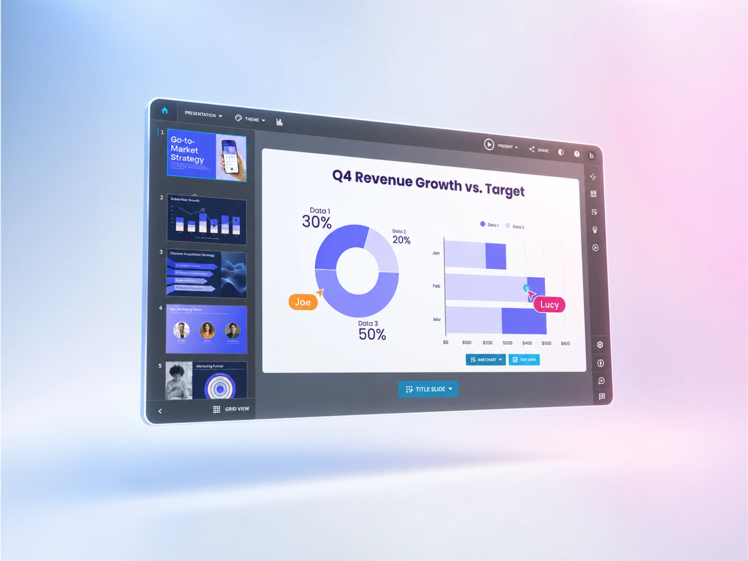
We show our real, live product interface in our brand light. Brand colors subtly spotlight and frame the platform, showing off our work-ready features.
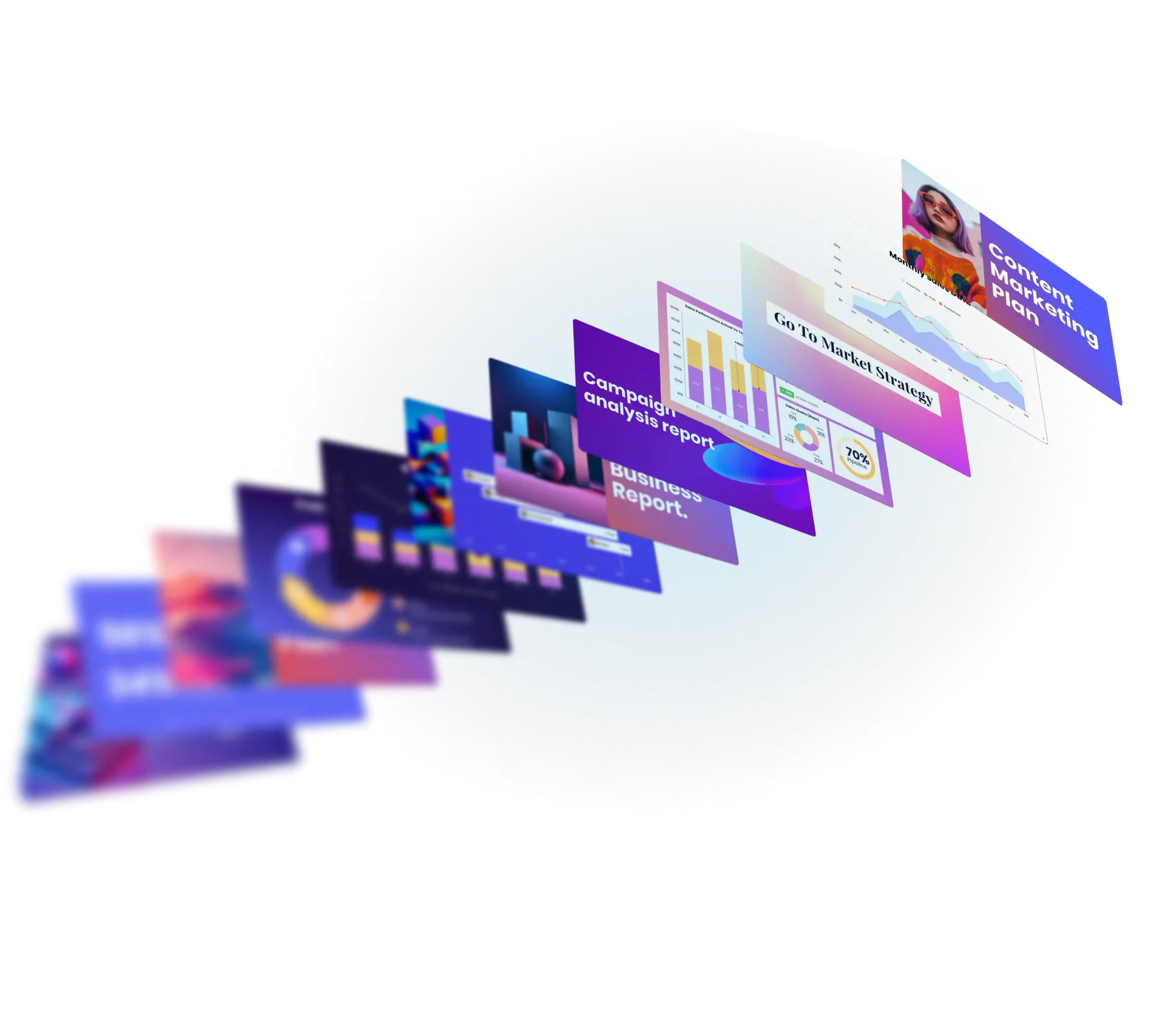
Decks are hero in abstract space, with nothing in the frame slides and brand spotlights. The background is brand backgrounds or a neutral picked from the slide content.
These hold for every image and every shot type. Break one and the image doesn't ship.

Turn the professional’s face toward the light so it spotlights them. Let the light fall off or wash the space around them as the setting needs. The warm sun sets our pros apart from the cool neutrals of our product and slides.

Shoot from seated table height past a soft foreground object, such as a glass, a mug or a colleague’s shoulder, so we feel in the room.

We photograph pros mid-action or mid-gesture, the way a documentary photographer would, so every image shows real work in progress. Nobody poses or sits idle for our camera.

Hold 1 hero with room to breathe, and place their eye line on a third. When we show 2 or more colleagues, the light favors the professional the story is about.

Cast wide across role, age, geography, ability and body shape, so every professional sees their team in our frames. Dress them in classic, timeless workwear in quiet neutrals, with brand color accent that fills no more than 10% of the frame. We show heritage only through real features, never through cultural jewelry, dress, decor or props.

The product or slides sit in frame as a secondary part of the work, with screens framing the professional. Words and graphics appear only on the slides or product, while the rest of the frame has no writing, signage, logos or numbers.

Every slide we show is one professionals can build in our platform today. We generate blank slide faces and place real slides on them in post.

Set slides on Gallery Grey or Base Blue. A soft glow of Agency Azul and Ready Rose fills no more than 20% of the frame.
Show thin slides floating, flying or pulling apart in depth, and let them run past the edge of the frame so the deck feels endless.
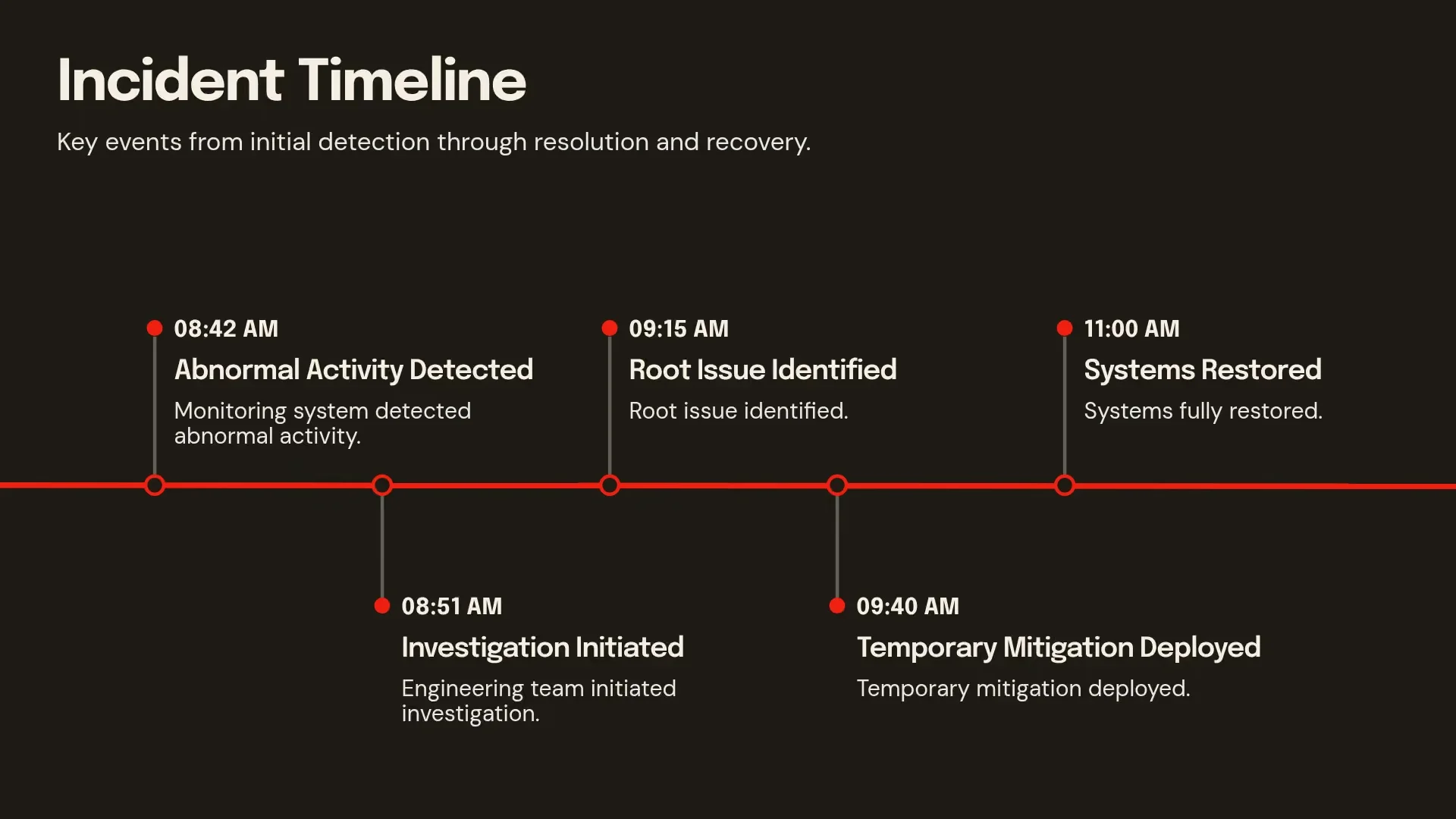
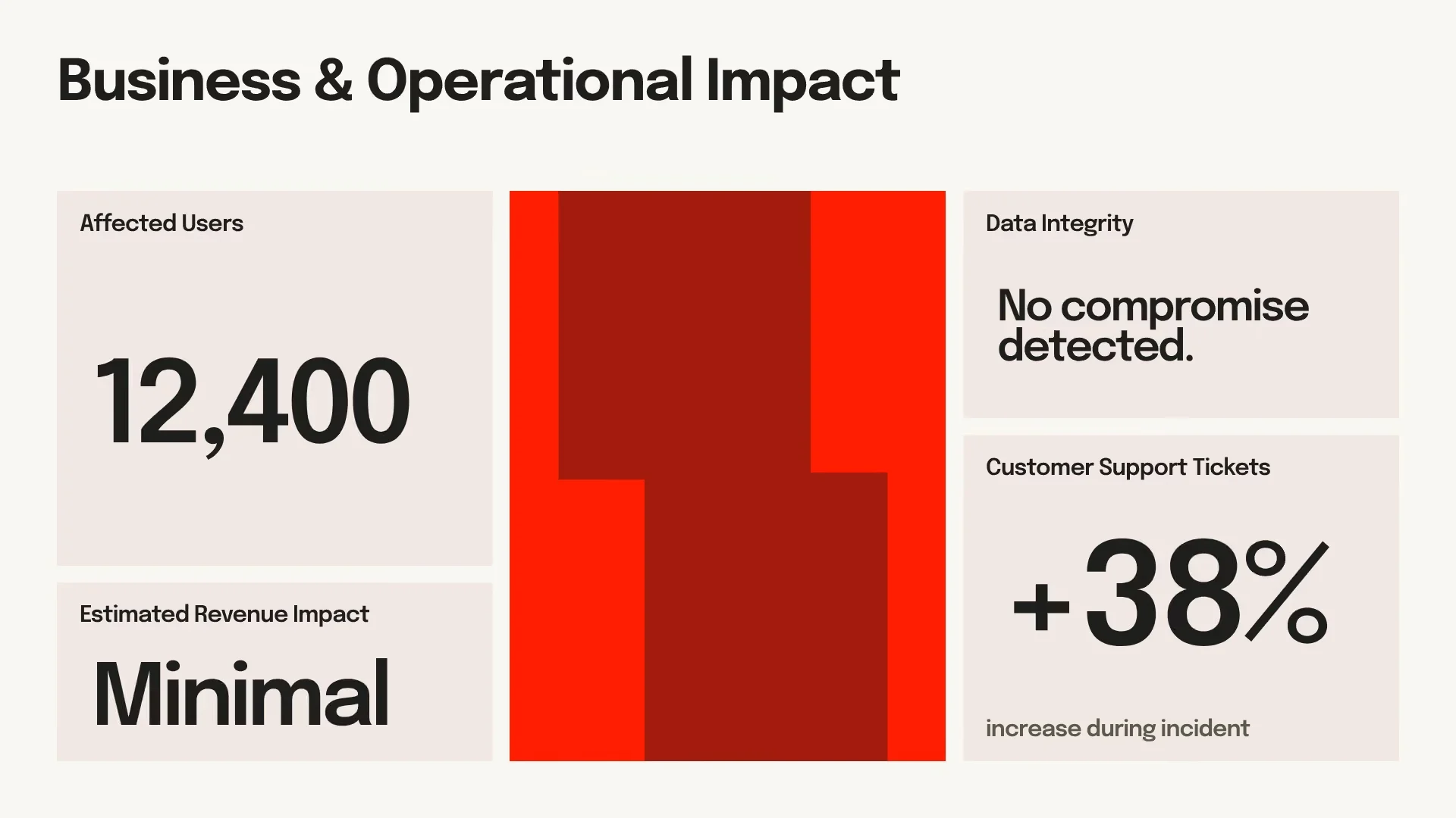
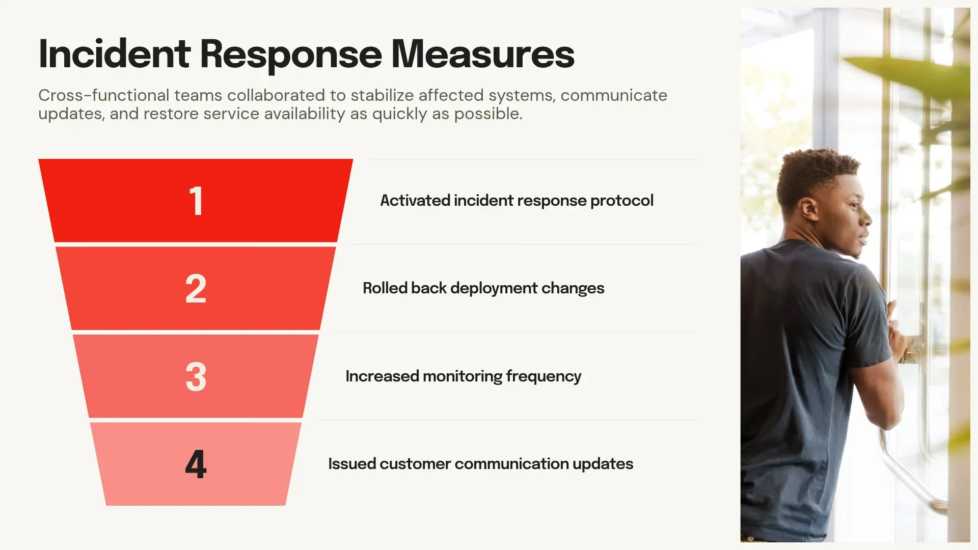
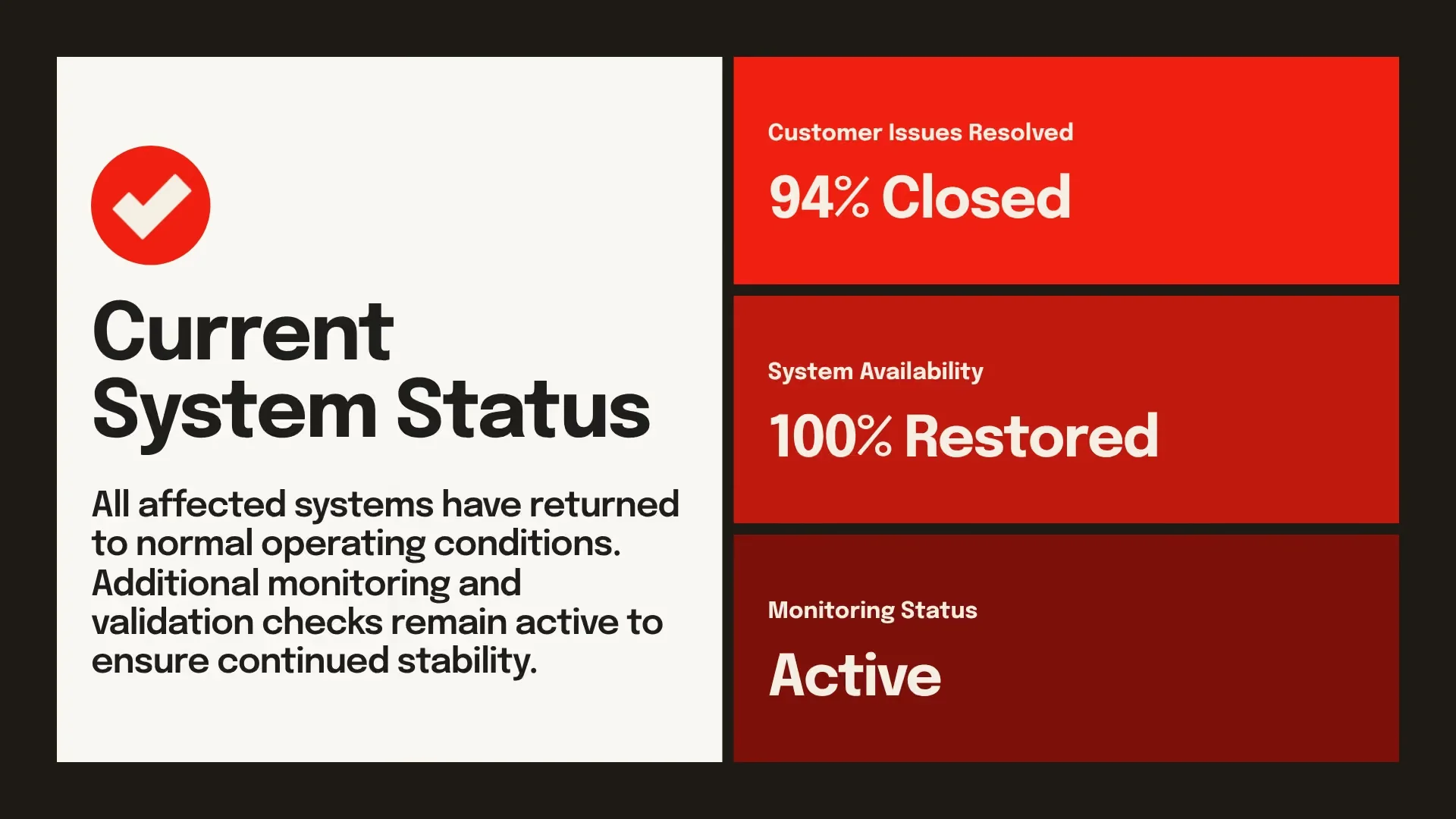
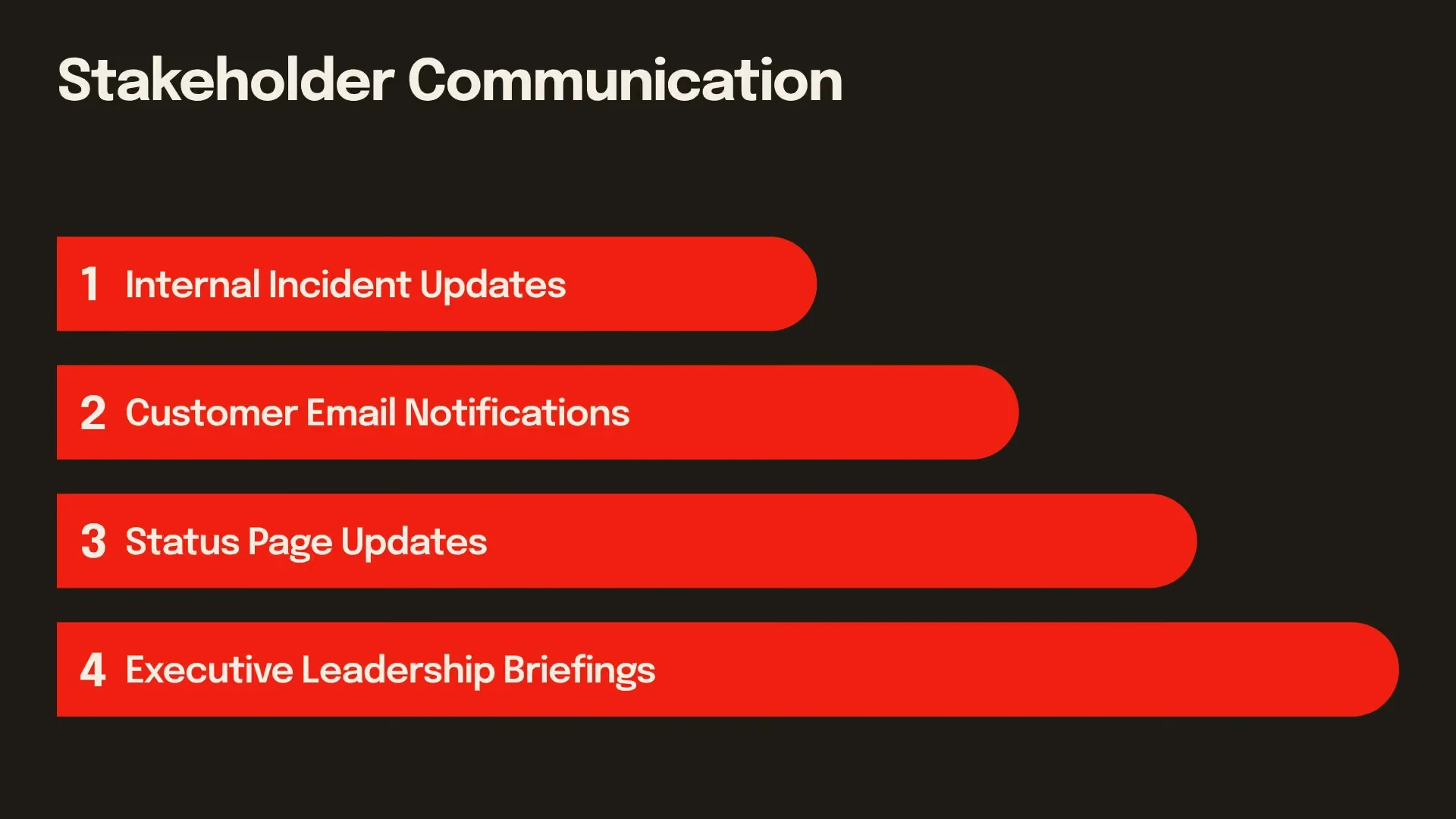
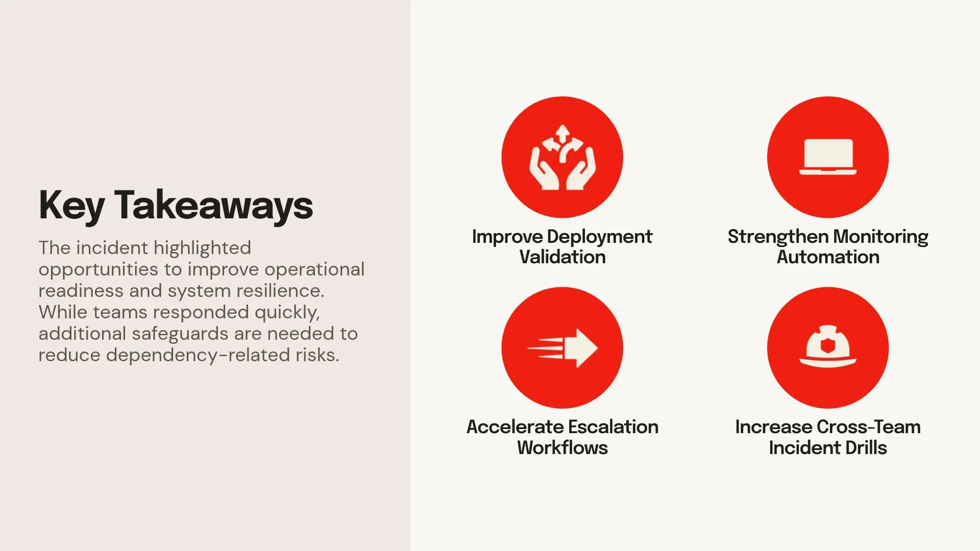
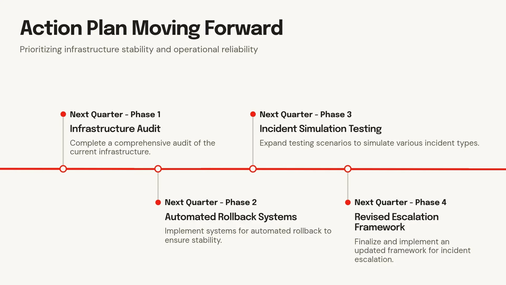


Show a business story across the deck. Headlines, data and charts build from the problem to the result, so every deck reads as one argument.

Show slides from a range of real industries, because we serve serious business. Every company, metric and headline reads as plausible work.
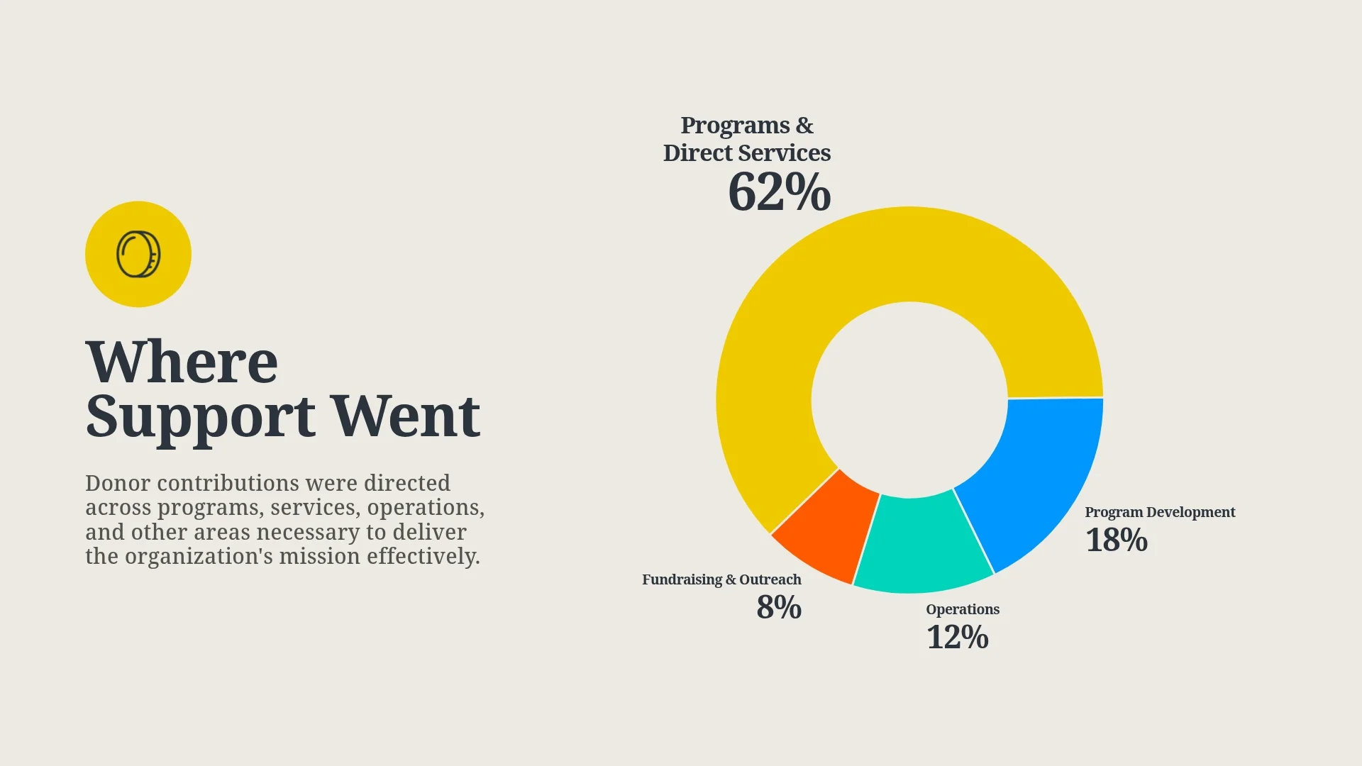
Choose simple, clear slides over busy ones. Professionals scan the deck and understand what it is about at a glance.
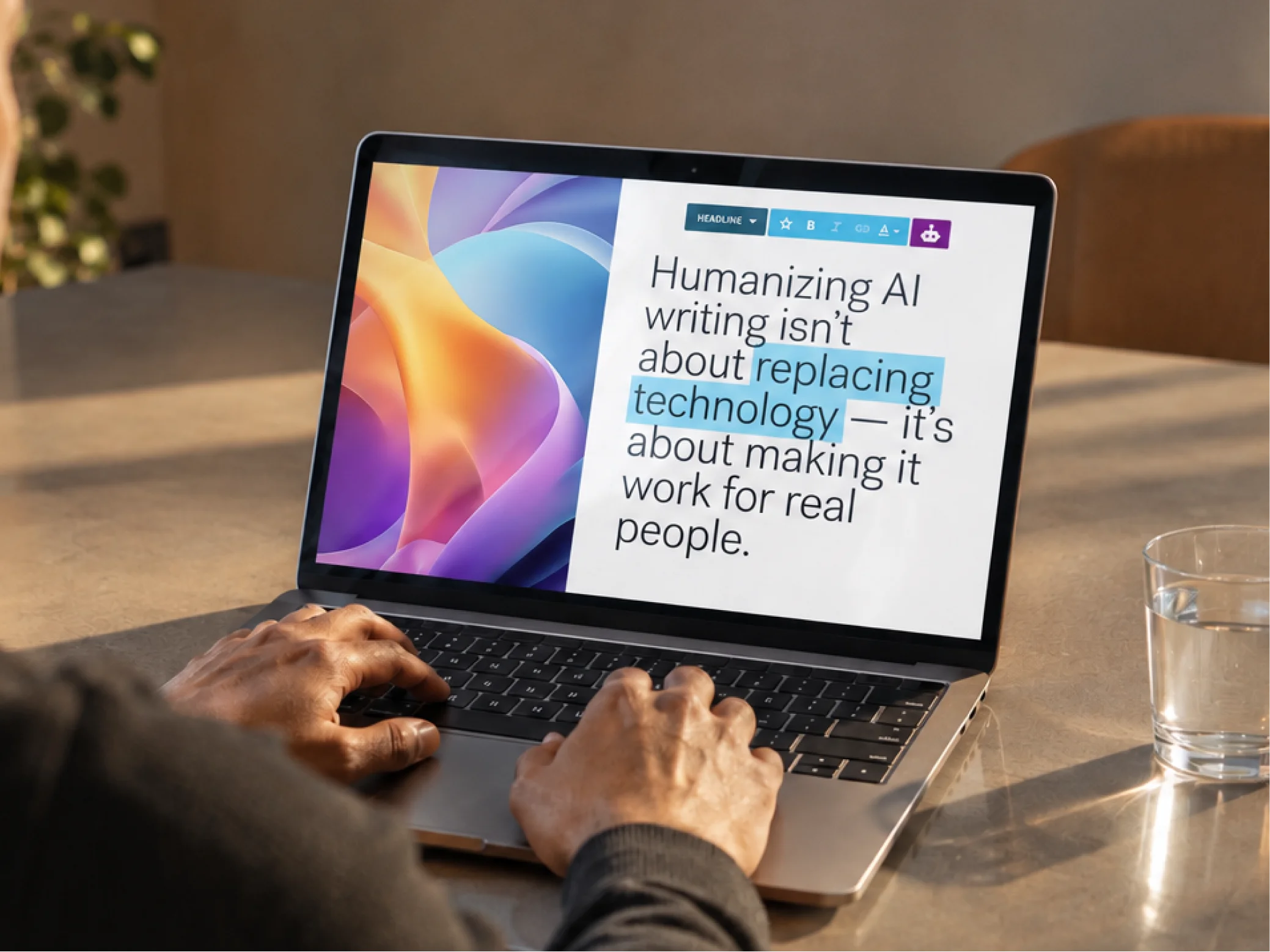
We show our live product as professionals use it today, in a photo or in open space, never a mock-up.
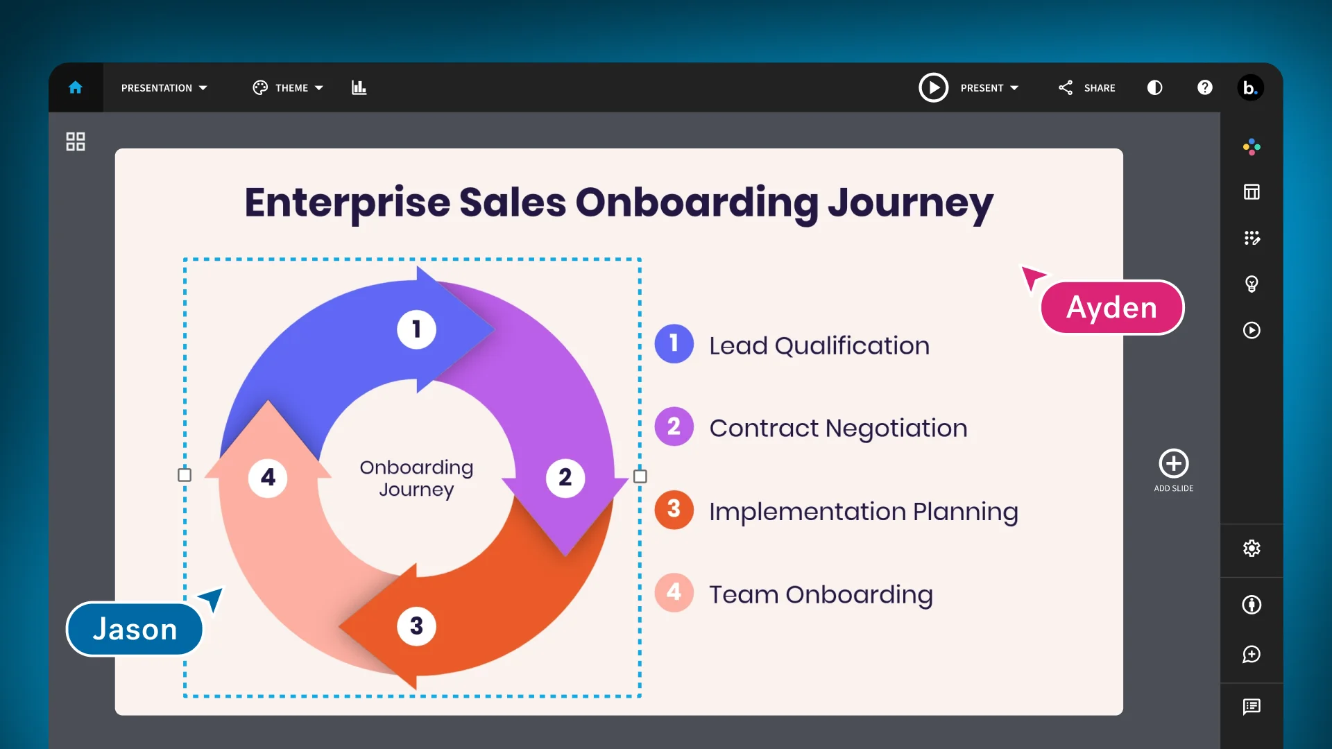
We crop out extra controls and magnify the one that matters, so pros read it at a glance.
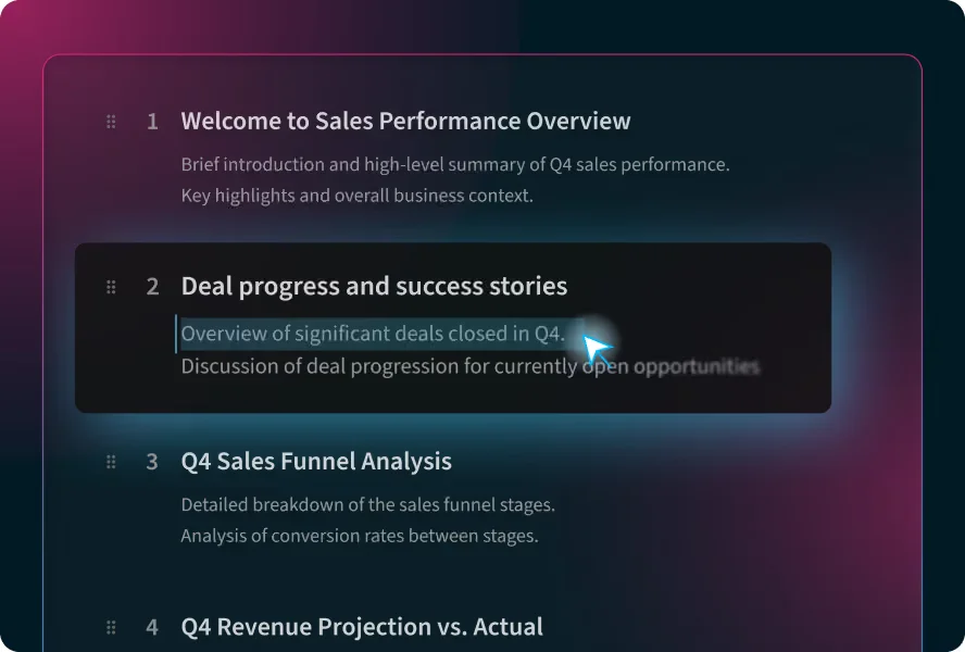
We set the product on Gallery Grey or Base Blue, in a soft Azul and Rose glow.
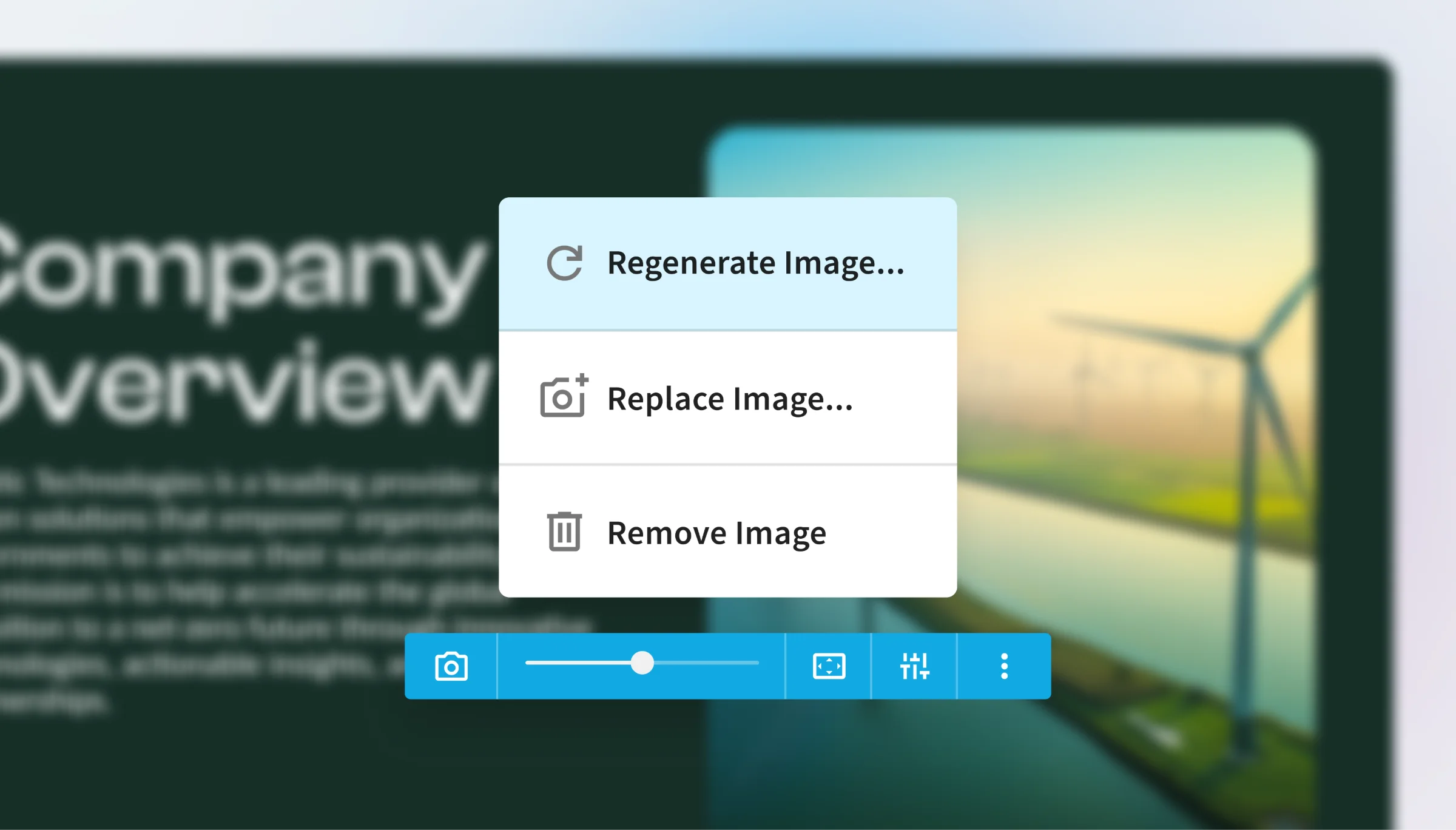
We show 1 feature at full size and in sharp focus, with the slide behind it soft.
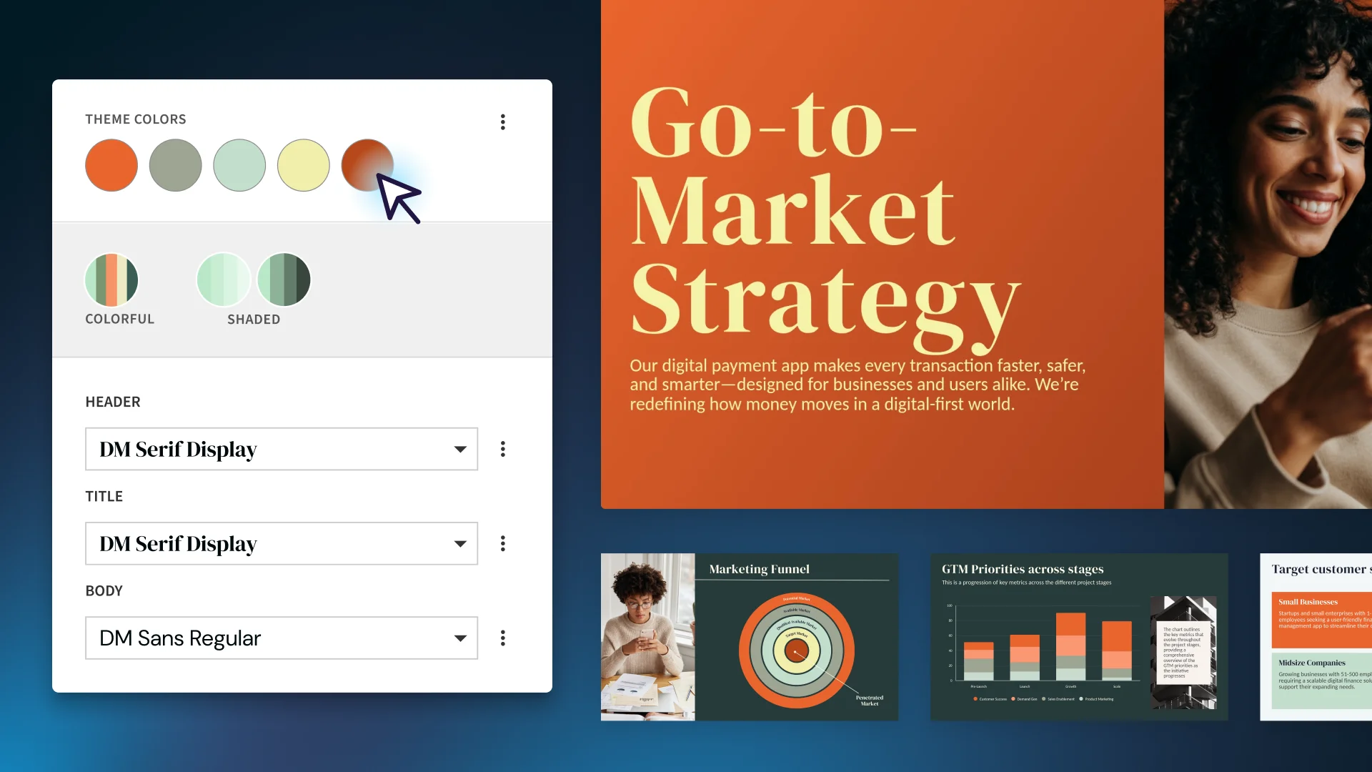
We call out the control beside or on top of the slide it changes, so both read in 1 frame.
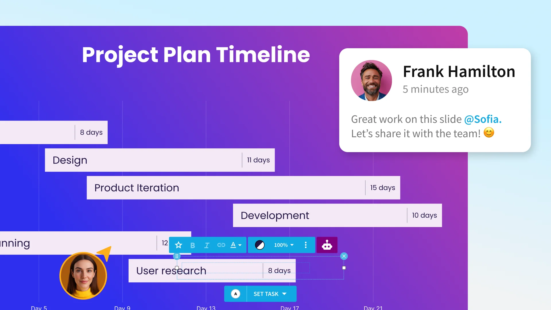
We add a teammate avatar, name, cursor or comment to point at the feature and tell the story.
Attach the image from step 1 first, then each real file as its own image, and run this prompt. It works in photos and in open space. To place slides and product in 1 scene, run the product prompt first, then the slides prompt on its result.
Edit the first image. Place the other images, our slides or product screenshots, as thin, flat, rigid panels floating in the open space around the professional, 1 per image, in order, the first nearest the camera and largest. Use 3 to 6 panels at varied depths. The nearest panel may run off the frame edge. Change nothing else.
Perspective: build every panel inside the photo's own perspective. Find the photo's horizon and vanishing points from the room's lines, such as window frames, walls, shelves and the desk edge, and set each panel in that space so its top and bottom edges run toward the same vanishing points as the room and its sides stay parallel to the room's verticals. A farther panel is smaller and sits closer to the horizon. A panel turned from the camera shortens only as much as that perspective demands. The perspective must be absolutely believable, as if the panels were photographed in the room.
Never cover the professional's face or hands. Only the nearest, lowest panel may overlap the edge of the laptop.
Apply each image with only a perspective transform, pinned to its panel's 4 corners. Keep each image at its own ratio. Never redraw, stretch, squeeze or crop it.
Match the scene's light, shadows, focus and grain. The light that falls on the professional falls on the panels. Each panel has a low satin finish, a thin crisp edge and a faint shadow or reflection where the scene would cast one. Panels near the professional's focal plane are sharpest, and the rest soften only slightly.
Keep every word, number, chart and photo identical and legible.
Edit the first image. Place the other images, our product screenshots, on the blank screens, 1 per screen, in order, the first on the largest screen. A screen can be a real device in a photo, a plain frame or bezel with no device body, or a floating panel in open space. Remove or turn off any spare screen. Change nothing else.
Apply only a perspective transform: pin each screenshot to its screen's 4 corners. Never redraw, stretch or crop it. If the ratio differs, fill the edge with the interface's background color.
Match the scene's light, shadows and grain. On a device, keep the display slightly brighter than the room and add a faint reflection on the glass.
Keep every word, number, chart and slide in the screenshot identical and legible.
Edit the first image. Place the other images, our slides, on the blank slide faces, 1 per face, in order, the first on the front or largest face. A face can float in open space, sit in a plain frame or bezel, or be a screen or TV in a photo. Remove any empty face. Change nothing else.
Apply only a perspective transform: pin each slide to its face's 4 corners. Keep every slide exactly 16:9. Never redraw, stretch, squeeze or crop it. A face turned away shortens the slide only as much as the face shortens, and a slide partly hidden behind another is covered, never squeezed into the visible part.
Match the scene's light, shadows and grain. In open space, slides are flat and rigid with a low satin finish. On a screen, add a faint reflection on the glass.
Keep every word, number, chart and photo identical.
We use motion to help professionals get to know our product and to build excitement around what's possible with our platform.
We hold every animation to 6 principles, and the best work meets all of them at once.
We move to give professionals the feelings they want from their work, such as the excitement of a new idea or the satisfaction of a finished deck.
We move with intention, showing our mastery and command to earn trust.
We move to feature, focus, and to deepen understanding.
We move with an air of effortlessness and comfort, so building a presentation never feels like a struggle with the tool.
We move like the smart and flexible platform we are, adapting each layout as teams add and rearrange their content.
We move only with intent. Every motion serves the story, an interaction or feedback, and we cut anything that does not.
Icons come from Material Symbols, outlined and lightly rounded. No emoji, no hand-drawn glyphs or whimsical illustrations.
Outlined, rounded variant, unfilled. Stroke weight 300 with no grade. Optical size matches the size the icon is shown at.
24px is the standard. 20px in dense UI. 48px for feature icons.
Inherit text color by default. Cyan only when calling for action.
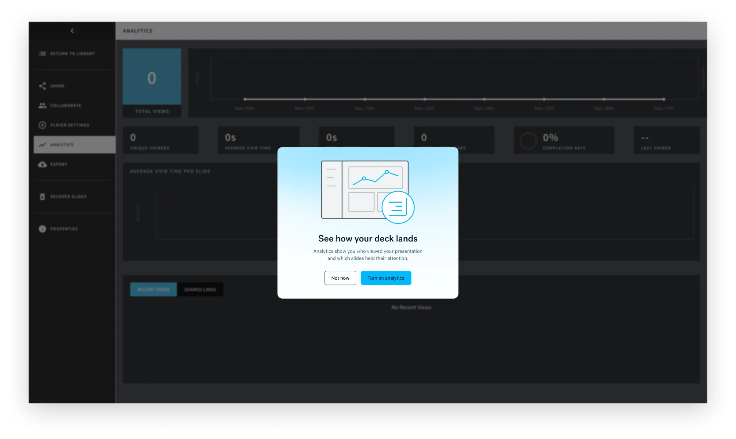
We use spot illustration sparingly and with intent, mainly inside the product to guide professionals through a moment such as sign-up, an empty state or a new feature. We draw it in the icon vocabulary, one step more complex.
Here the illustration introduces a feature in a modal, so professionals understand it before they turn it on.